
How do you break into a UI/UX design role even during a layoff period?
Learn what UI/UX design recruiters are looking for when evaluating portfolios and what you can do to start learning

There's a heavy increase in layoffs in light of the recessionary period happening in the west. It's almost as if you see posts like this one popping up on your Twitter feed almost every other day.
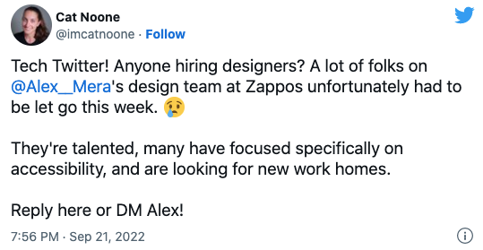
As a newbie designer you're probably worried looking at this and thinking "if senior designers are getting laid off, how will I make the cut?"
Is the time, money, and effort on a degree, bootcamp or course going to actually help you land a job? Will it be worth it?
The cookie cutter advice of having a decent portfolio and having good connections isn't cutting it anymore.
So, how do you go from being constantly fearful and anxiety ridden to confidently knowing that you're working on gaining the right knowledge and skills that will be valuable to employers? And yes, even during a layoff period.
What my experience has been so far
I've worked as a front-end developer, a UI/UX designer, and now I'm working as product manager at a seed stage startup. I've been in tech for 7 years in total. Now that I have more of a product oriented role, I review other UI/UX designers' portfolios to determine whether they'll be a good fit to work with this startup.
After reviewing at least 20-30 portfolios and resumes, I noticed a pattern among the best ones I'd hire right away.
I could say alot about what makes a good designer, but this one question I ask myself is the deciding factor between being interested and moving on to the next portfolio.
"Can you leverage all of what Figma has to offer?"
If you didn't know, Figma is a design tool that helps you create user interface designs. It's a powerful tool.
I've noticed that I'm asking for or looking for a designers work in Figma itself to shorten the time it takes for me to determine whether they will be a good fit. This is because a Figma file contains artifacts and clues of whether a person would make a good UI designer or not.
You may argue that this is dependent on who is reviewing your application; they could be someone with no formal design experience. However, having this expertise is required to be a competent UI designer and to do a good job that companies will appreciate.
Here's specifically what questions I am trying to answer when evaluating a Figma file and how you can start incorporating them in your projects.
After reading this post, you will have a clear direction on what you need to work on to be a desirable designer regardless of the economic condition.
Are you creating Visual Hierarchy with Figma?
Giving priority to certain details in a design comes down to understanding what that specific page or section cannot live without. How do you give it the attention and contrast it deserves so the user knows exactly what to do on that page once you've figured it out? This is where visual hierarchy comes in handy.
So, how do you create Visual Hierarchy in Figma? There are numerous approaches, but here are 3 of the most important and fundamental.
1. Maintaining harmonic typography with Text Styles in Figma
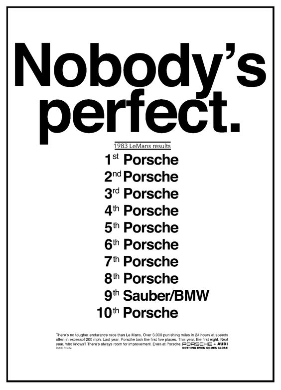
Typography is a cornerstone of hierarchy in any visual design discipline. Even before UI design, publishing organizations relied largely on typography to catch someone's attention and encourage them to read more. Take a look at this Porsche advertisement as an example:
In UI design, if your users are unable to read and comprehend your content they'll immediately drop-off or find a solution to their problem elsewhere.
I started learning about typography through graphic design, mainly through this video from Chris Do.
For me, the bridge between typography in graphic design to UI design comes through something called the modular scale.
A modular scale is a sequence of numbers that relate to one another in a meaningful way. Using the golden ratio, for example, we can produce values for a modular scale by multiplying by 1.618 to arrive at the next highest number, or dividing by 1.618 to arrive at the next number down. By multiplying the next highest number (or dividing by it) we can set some rhythm and contrast to typographic elements we want to give attention to. - Tim Brown
You can cut down the manual multiplying/dividing by using a Figma plugin called Typescale to produce the text elements needed to create the reusable styles. Watch it in action below.
After it's generated, you can convert them into text styles by selecting the text layer on Figma and then hitting the little "+" next to its properties.
2. Defining a colour palette with Colour Styles in Figma
Many new designers make the mistake of using the color picker without first specifying color styles while building UI.
Allowing yourself to utilize an unrestricted number of colors across your designs may appear to be more easy, but it only leads to inconsistencies and a lack of hierarchy. On the flip side, using only a few colours can also hurt the hierarchy of a design.
Even if it is simple, creating a color palette is vital for the UI design process and will save you a lot of time and hassles later on.
You don't need to make 50 shades of gray (pun intended). This will lead to a decision paradox in which you won't know which gray to use or have used in the past. Instead, work towards 6 to 11 and use them purposefully and consistently throughout all of your components. For example, gray 400 should always be used for borders on input fields and gray 200 for dividers. When you do this you'll mentally start to develop a pattern.
3. Define a spacing system to be consistent and work faster
Spacing, like type and color, has an impact on visual hierarchy. When you don't work with a spacing system, you wind up with a cluttered design and it also makes it difficult to remember which value you used for what when creating new components or layouts.
By starting with a grid-based approach, you can implement a spacing system. Grids come in two sizes: 4px and 8px. This means that each element can be divided by 4 or 8 pixels.
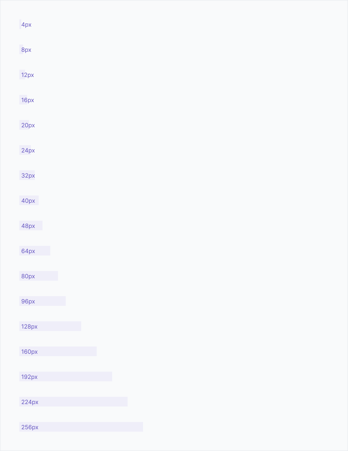
For large elements, I try to utilize multiples of 8px for measuring, spacing, and positioning. Use 4px for smaller adjustments on smaller elements.
When you go with a grid based approach, you may create designs faster and make it easier for developers to establish a pattern as well. This will increase the likelihood that they create frontend code that's consistent with a high fidelity design.
Are you making use of components?
Components are useful in Figma because they allow you to build a library of reusable elements. You can then drag and drop them into your designs and modify them with variants and properties (extensible functions of components in Figma).
Creating components saves you time and allows you to be consistent
I once worked with a freelancer who felt that using components in their design was unnecessary for the scope of work. However, some elements were clearly reused, so I asked them what happens when I provide feedback and they are required to make a single change in multiple places? That would've taken time when you could've made the change on the component and it would've reflected in the child components.
I used to have trouble recalling the spacing between elements and the colors. However, by using components, I no longer have to remember it while designing; simply define it once in the component and then copy-paste that asset where it is required.
If you have a sketch of your design you know which elements will be components. I make sure whenever I am creating something new to make it a component first before continuing any work. Thinking in the "component-based way" rewires your brain to be more efficient as opposed to just laying out elements and copy-pasting them into new frames (this is more time-consuming).
Are you making use of auto-layout to create your designs?
Auto-layout is a crucial feature of Figma. Before it existed, you had to manually align elements on a Figma frame. This wasn't ideal because you'd end up making mistakes when spacing elements because you'd have to constantly use the inspect feature in Figma (command + hover) between adjacent elements to view if they were correct and consistent.
If the mistakes kept adding up you'd end up with a fairly odd looking design and you'd have a senior designer or manager on your shoulder saying "something looks off here".
This problem is solved with auto-layout, which has been one of my favorite Figma features since its release. If a portfolio I'm reviewing doesn't use auto-layout when it could, it's usually a bad sign. It is suitable for most situations.
Furthermore, the newest version of Auto-layout coupled with layer resizing enables you to build out dynamic designs quickly. Explore more about auto layout in the Figma help docs. It's the only one you need to learn.
Here's what you can do immediately to start applying this knowledge to land a design role
- Learning and practicing fundamentals might be difficult without a starting point. Use Untitled UI, a free and paid UI kit, and use their styling system instead of building it from scratch.
- Use the Styler plugin to extract the styles from their file and then paste it into your own project. Then use the Apply Styles function in Styler to automatically create the required styles (you'll have to make some adjustments)
- Start copying screenshots of UI design patterns from a site like mobbin.design. Try recreating them exactly as they are with visual hierarchy, components and auto-layout in mind. Do this everyday to skill up. There are no shortcuts in this step, you'll have to practice.
- When you're confident in the above step, explore interfaces that annoy or frustrate you (government websites are a good place to start). Draw a small sketch on paper to reimagine a better method to design it. Then, with Figma, turn it to a high-fidelity design.
- Upload simple shots of it in a place where recruiters/people looking for your work will be able to view it easily. Dribbble would do. Avoid uploading login/signup pages because it's too common of a pattern across many designers. Humans are good at pattern matching so uploading designs that are similar to what others are doing won't help you stand out.
- Use the Figma file to showcase your efforts when presenting your work. If the individual you're speaking with has a design background, they will be able to better understand your efforts. If they don't have a formal design experience, your designs should be visually appealing enough for them to add you to their consideration set. You can go even further by educating them on the time/cost savings by explaining what I've portrayed in each section.
- Start receiving exciting offer letters!
Being a good designer for a company is meant to generate revenue for them. However, success takes time because a design must be developed, marketed, adopted by the customer, evaluated, and iterated on. Smart companies understand this, so they're mostly searching for foundational knowledge and the ability to fully utilize a tool like Figma so that they don't get bogged down in the early stages. What I've described in this piece is the basic minimum, but as you keep practicing, it's not a matter of how, but of when you'll get the job.
Don't miss my next post! Subscribe to my email list to get tidbits like this in your inbox.
What I referred to when creating this article
- The modular scale (https://alistapart.com/article/more-meaningful-typography)
- Untitled UI (there's a free version with alot of educational material)
- Epicenter Design - Getting Real